PAPILLION LANDING: A VISION
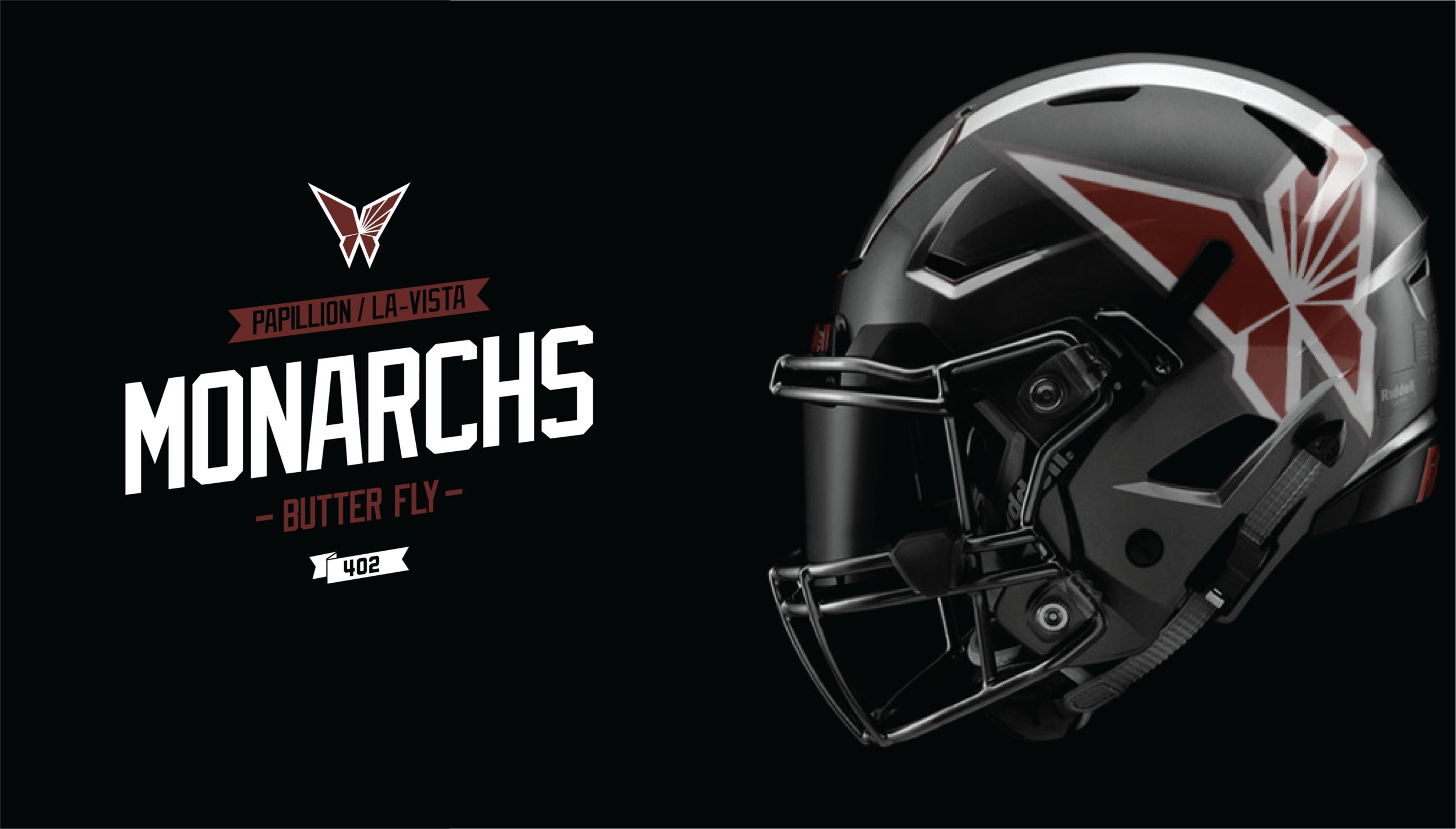
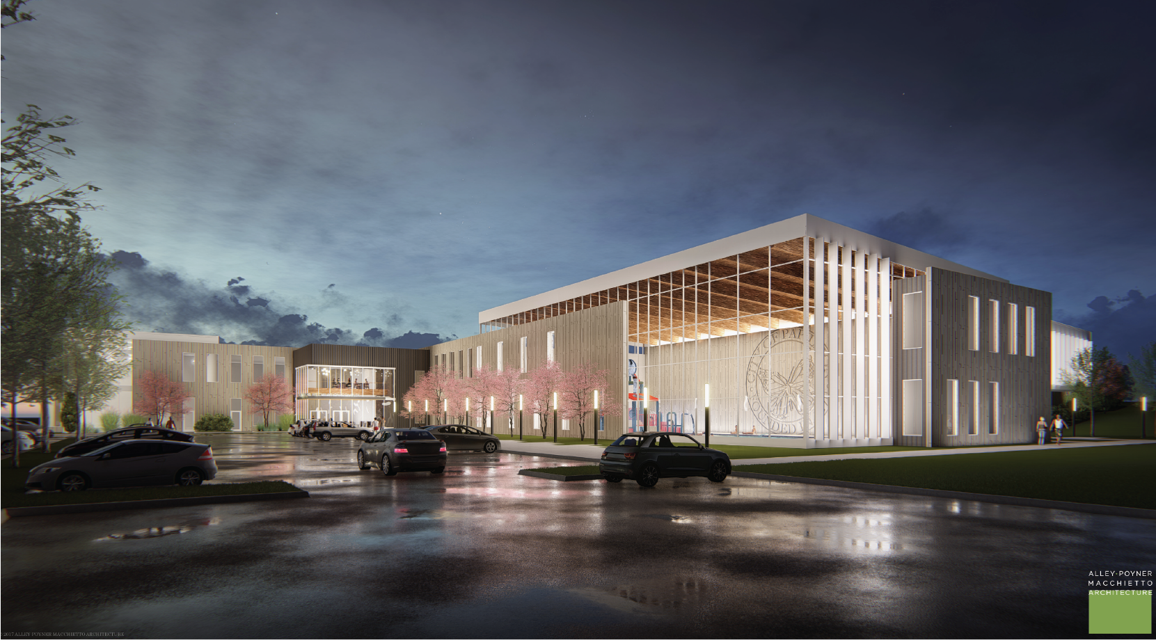
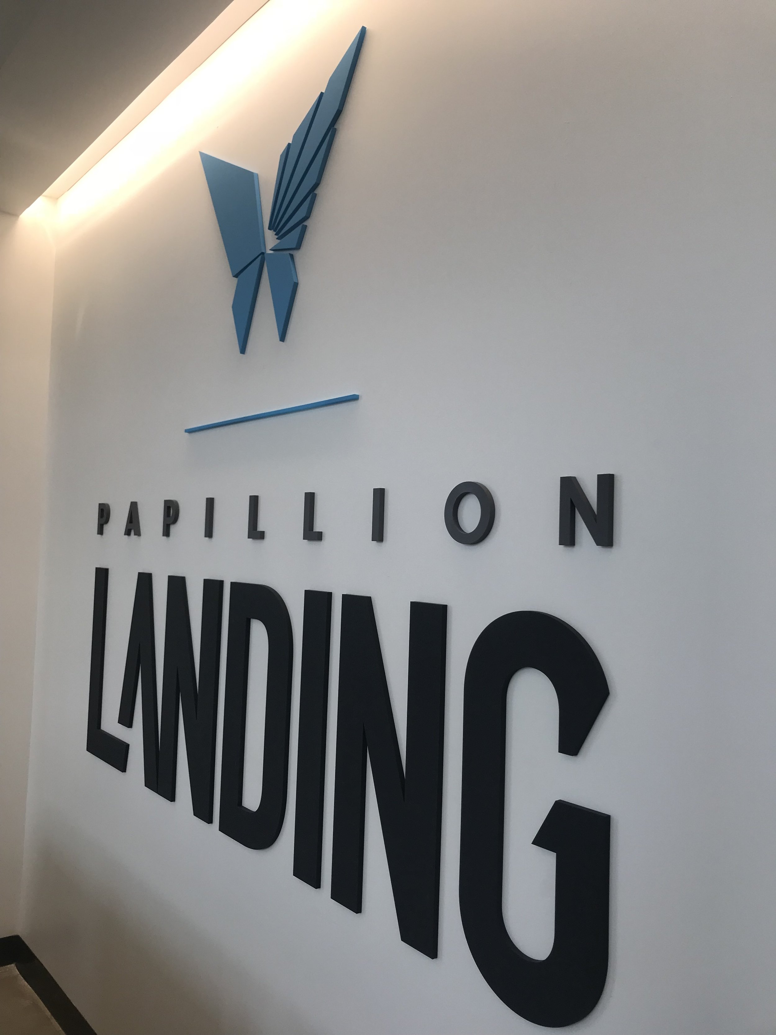
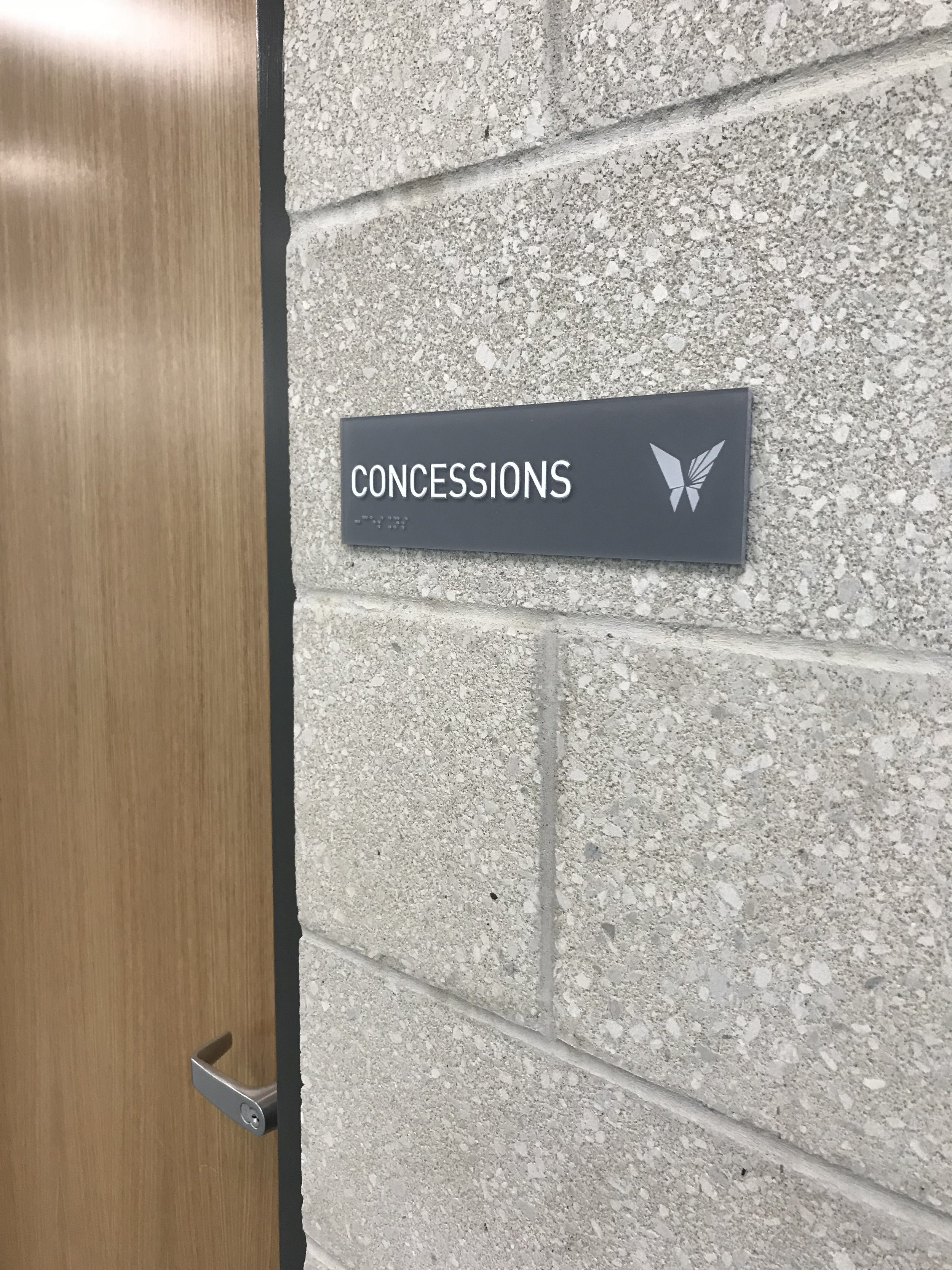
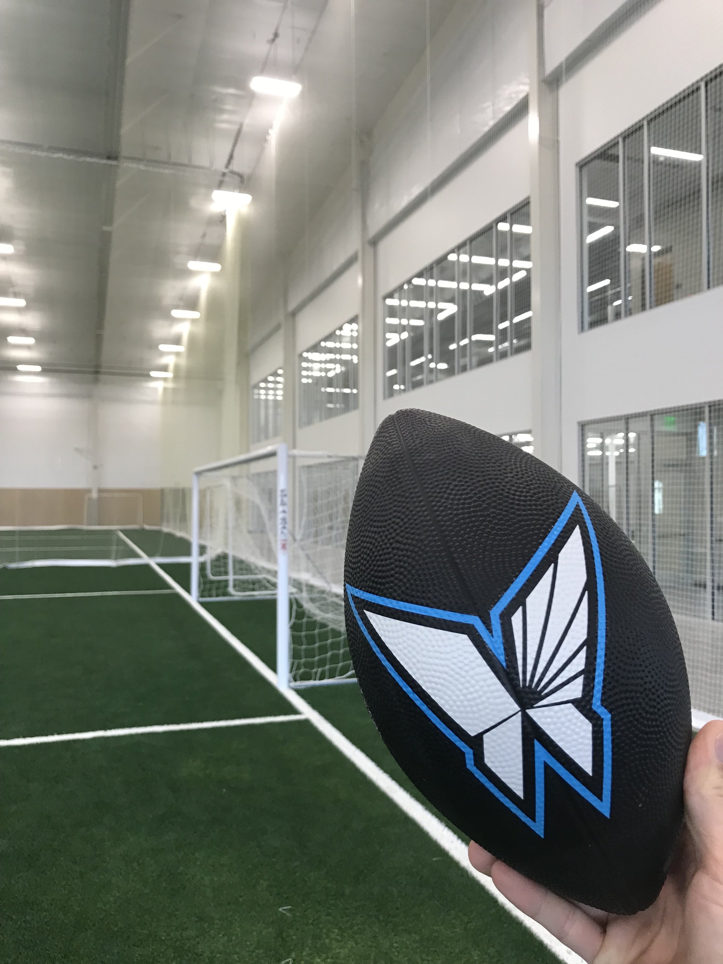
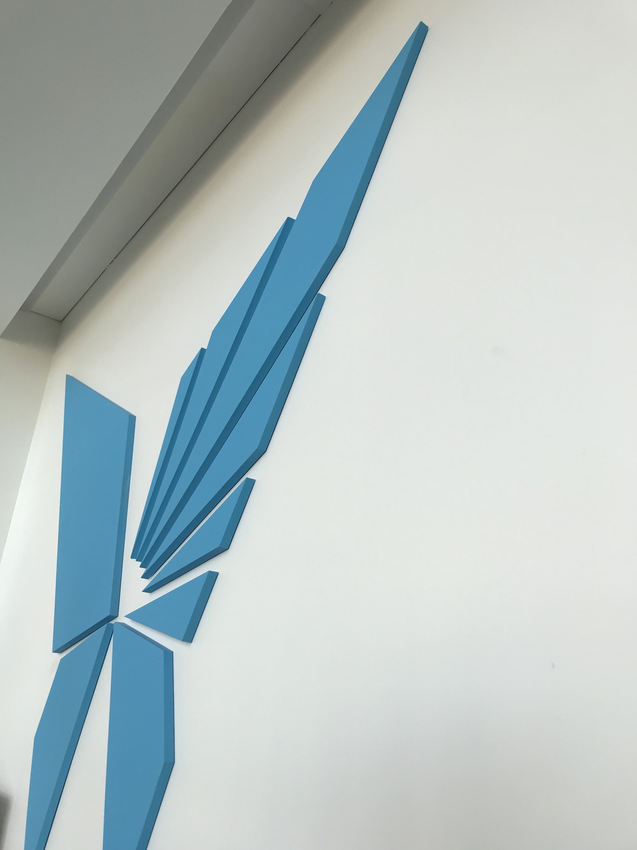
Papillion Landing® will become THE epicenter for community engagement. The IRON butterfly insignia that envelops the building is a triumphant representation of Arrival. A reminder of perseverance through journey and transformation, the building transforms the way we think about space, socialize and how we engage in community. As such, the identity system delivers a logo-mark that builds upon the principals of transformation, arrival, community and sport. Anthropometric proportions have been carefully considered and forms have been simplified to increase recognition and visually communicate a historic brand story in a modern context.
inspiration
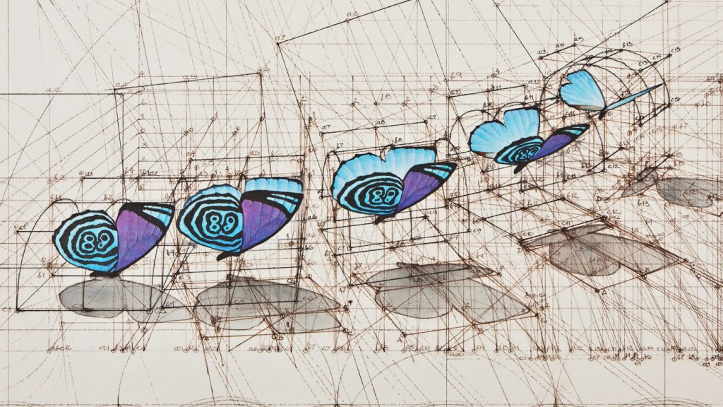
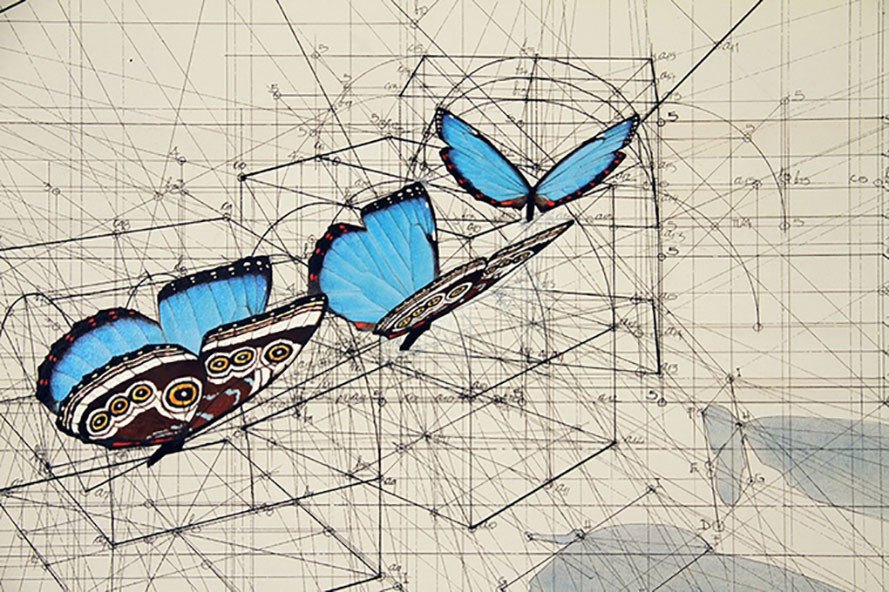
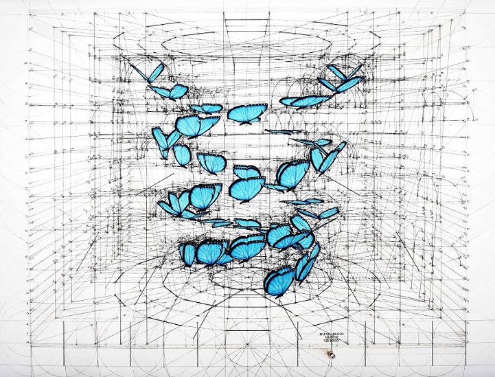
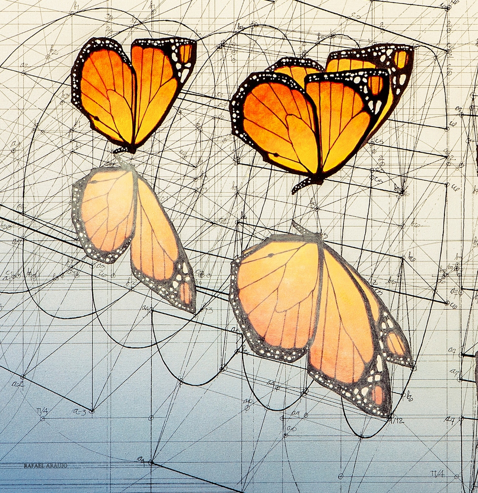
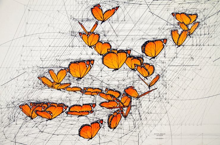
An in-depth study of butterflies and their flight patterns unveils a journey of peril where determination, community support and perseverance all lead to survival of the species. The mark needed to reference the familiar shape, but not in the literal sense. It needed an athletic stance. The harsh edge interpretive shape would give it stature and permanence. The Iron butterfly would become the fundamental source of inspiration



development
Sketching origami creases, folds, and faceted forms helped to provide a methodical approach to developing the shape geometry. It also provided a handmade quality, providing personalization, structure + symmetry. Superfluous details were removed to simplify recognition. Systematically defining form and proportion based on the Golden Ratio gave mathematical precision to what occurs naturally. Later explorations included thoughts on logo size and placement. Municipality icon transforming or simplifying as it relates to a specific property or use scenario.
THE "IRON BUTTERFLY" ICON
The obvious use of the butterfly is in the name of both the community and the facility. So how do we present what has long been the obvious icon of a town named for that thing? By bringing to light the overlooked attributes. Stout, strong, passing test after test; Sure they are beautiful, but look again and realize that every butterfly you see is a champion—the one who survived the dangerous journey of becoming. Wings wide open and held high, the simplicity leads to its iconic nature.
In a variation, you see the dawning of a new day in the span of its wing; a visual echo to the fact that a butterfly itself is a symbol for the ability to change and begin completely anew.
THE WORDMARK (LOGOTYPE)
Simply put, the name needed to visually hold up like a building, with aesthetic interest and a strong foundation. the name “Papillion” is clean and wide open, representing the community being far reaching and as varied as the people who live within. The more stout, customized sans serif typeface is strong and stable, coming closer together under the name “Papillion”—as it should be in the community. A neutral grey color palette delivers messaging that is uncomplicated and pure while a pop of cyan blue draws the eye in to celebrate the moment. Cyan blue, a vibrant color variation of water and sky was chosen to represent the butterfly icon: a naturally occurring iridescent shimmer color that can be found on the wings themselves. It can be used as a pin-line or whenever title text requires further emphasis.
Laurels + Pattern
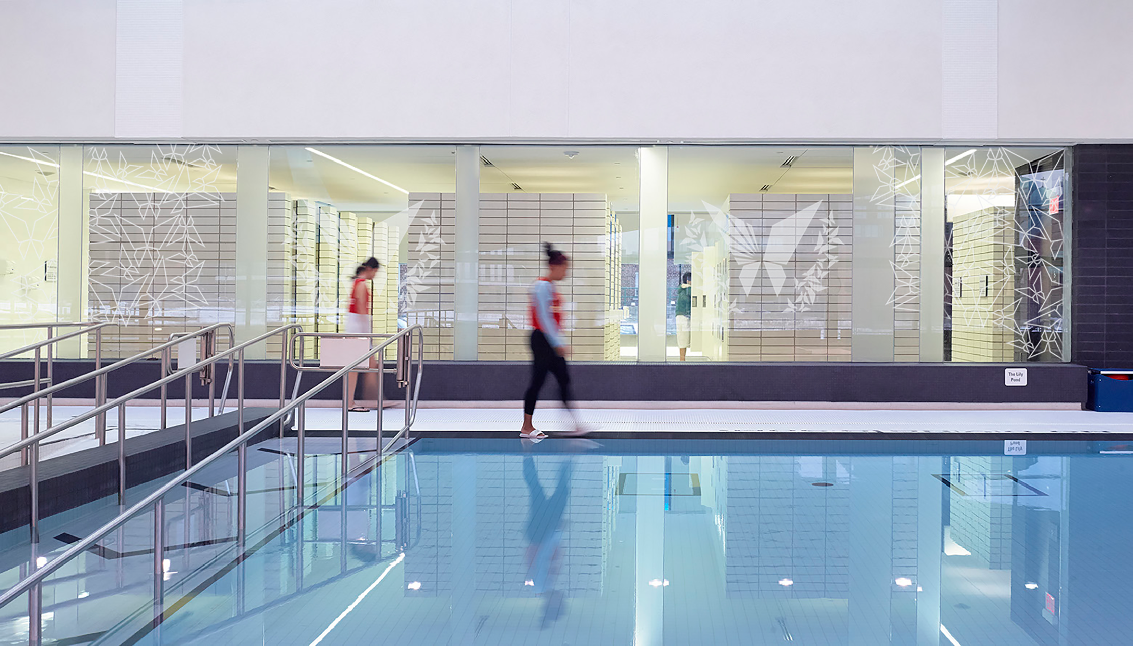
To give an added component to the brand system, a sort of crest was created. Like many crests symbolizing achievement, laurels are wrapped around the central icon. But look closer… The icon itself in miniature form, varying in size and arranged in positions to look like leaves, all come together to form the laurels. Coming together is a central motif of Papillion Landing. The smaller butterflies represent the people of the community, individually, coming together around a central iconic figure which represents the community on the whole.
This highlights the ability and flexibility to create patterning using only the main iconic mark itself; and so that is what was created—varied patterns for a variety of uses. An infinite “random” pattern (similar to how the laurels were formed) Gives the ability to simply fill a field of view, or create specific shapes. When used in outline from, the patterning takes on a geometric, fractal look of lines and angles which makes a striking visual.
THE CORE MOTIF OF THE BUILDING
As per the inception of the name, this facility is built on the thought that the entire community will be arriving here for their various wants and needs as offered and supported by the structure. The community is not just a part of the picture—they are the reason. They will be eating, dancing, playing, training, learning… all landing in Papillion


APPAREL + ACCESSORIES
VIDEO PROMO SPOT

THE NEW IDENTITY
COMMUNITY ENGAGEMENT POSTER

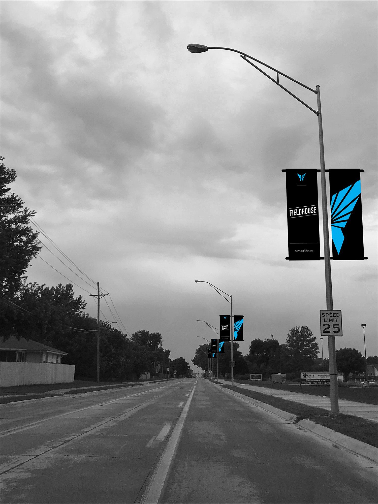
LIGHT pole BANNERS
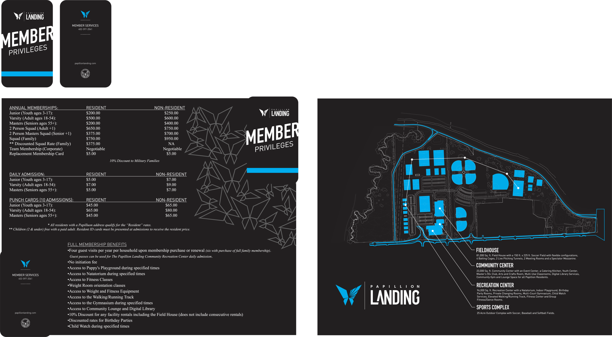
LAUNCH ITEMS





POTENTIAL BRAND ADOPTION
